re-brand / digital transformation / design ops

context
Coast Capital underwent 2 key changes at this time - a massive overhaul of their brand reflecting its identity as a purpose driven organization. The digital team on the heels of a technology upgrade was also undergoing an overhaul of process to improve speed to market and traceability. This presented some unique challenges but also some unique opportunities to the design practice.
Year
2022
Role
Senior Manager, Digital Banking
Goal
Interpret and implement the new brand for all digital journeys - acquisition, transaction and retention
Challenge
This implementation had to be shaped and realized while the larger team was being reshaped into squads and agile methodology was being rolled out.
Opportunity
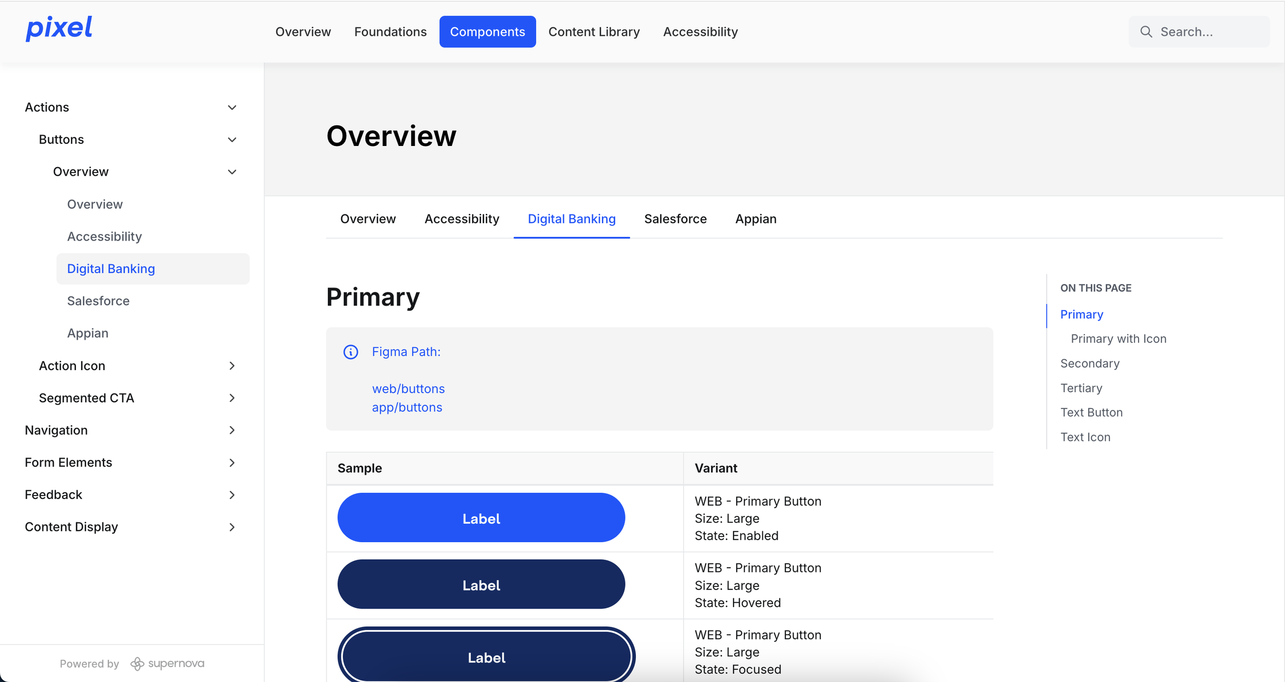
Created and rolled out a unified design system library which supported agile’s “definition of ready” and “definition of done”
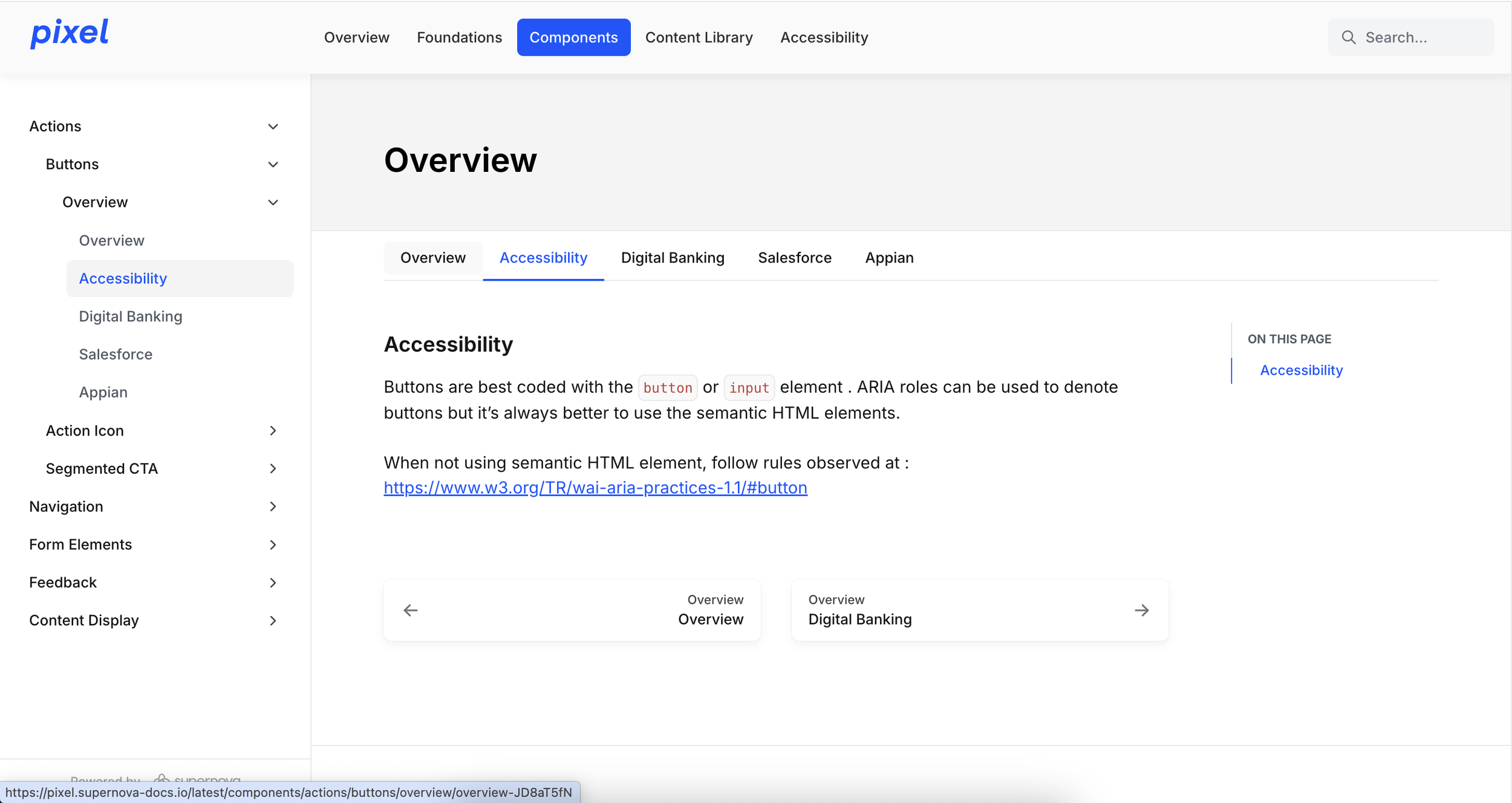
Assess accessibility and FE code quality by virtue of styling - re designing and optimizing components for more predictable sizing and implementation.
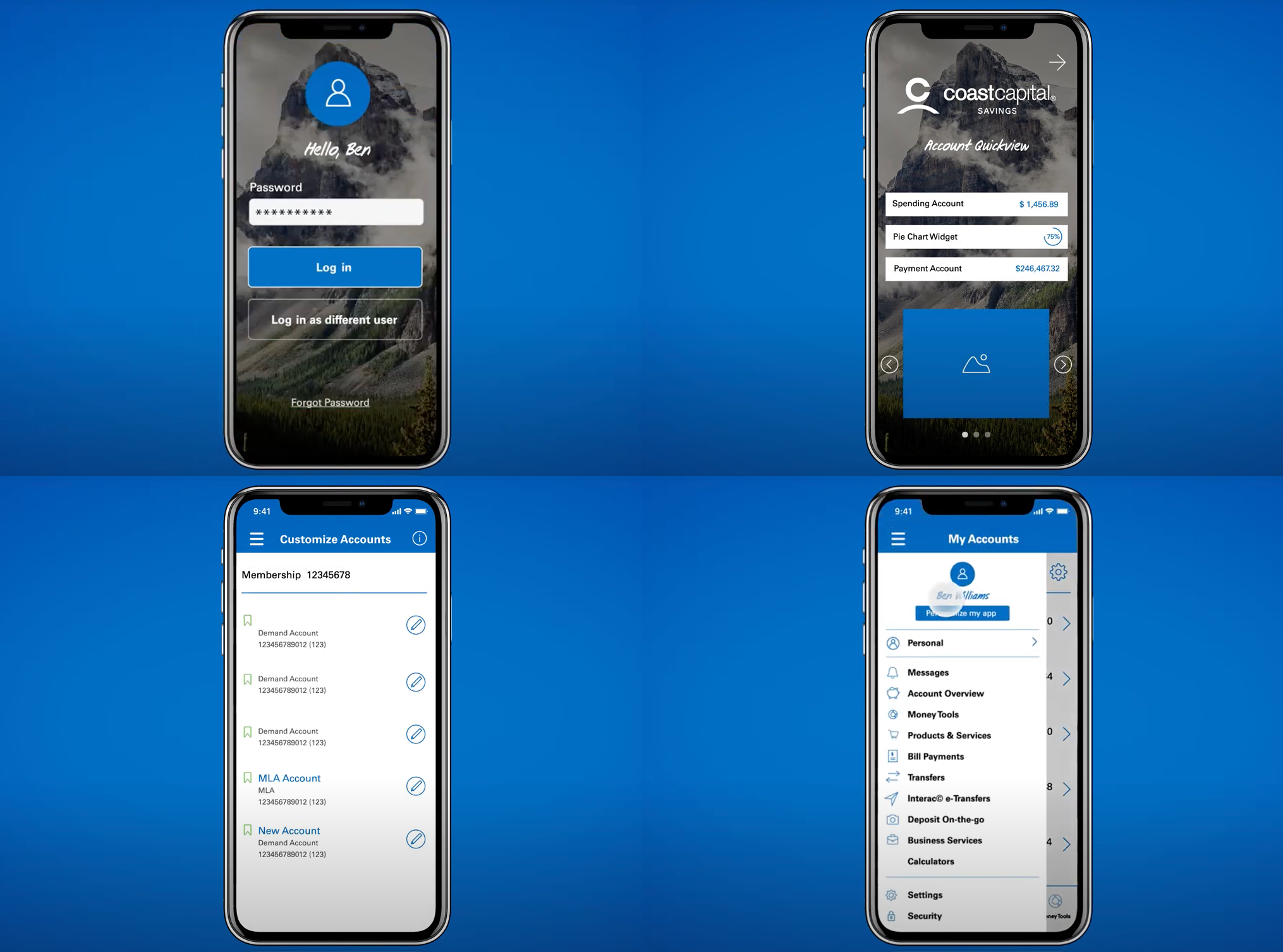
Previous Brand
Existing applications reflected the older identity, recent migration to a new tech stack had also meant adopting a lot of OOTB patterns and screens in order to make timelines. This left more to be desired from a member experience perspective.
approach
Started with an understanding of the new brand identity and the shift from the mindset of “ How can we help” to “We are for real” collaborating with Marketing and our Social Purpose Office.
Evaluated our code base to isolate and arrive at a strategy to roll out the rebrand while assessing the opportunity to address accessibility.
As our agile squads took shape - defined designing to sprint-along or sprint ahead shaping what a story might look like as the team established the “Definition of ready” and “Definition of done”
Brand Elements
1
Logos, Icons, Animations
Foundation components
2
Color pallete, App Store screenshots
General components
3
Buttons, Menus, App Bottom Nav, Footer
Generic components & Page layouts
4
Page Layouts, dialogs, modals etc
3
1
2
4
re-designed experience
The redesign was rolled out in a phased manner allowing members a slow introduction to the new brand while also allowing the digital squad to adapt to the rhythms of agile and sprints and release management
An interactive design system was created and socialized across a multi located design, development and QA team. This design system truly drove quality of output resulting in pixel perfect outcomes and establishing discipline across the team.
Accessibility was audited, triaged and guidelines were built into the design system. When front end tech and design debt was cleaned up, better accessibility followed and was established as part of “Definition of done”.
The design and dev team started speaking the same language as core page templates and general versus specific components were revealed and clarified.
We’re for real
Large volumes of design and tech debt were identified and eliminated as an outcome and the normalization of design patterns combined with a new brand resulted in a fresh, clean and crisp experience for members.
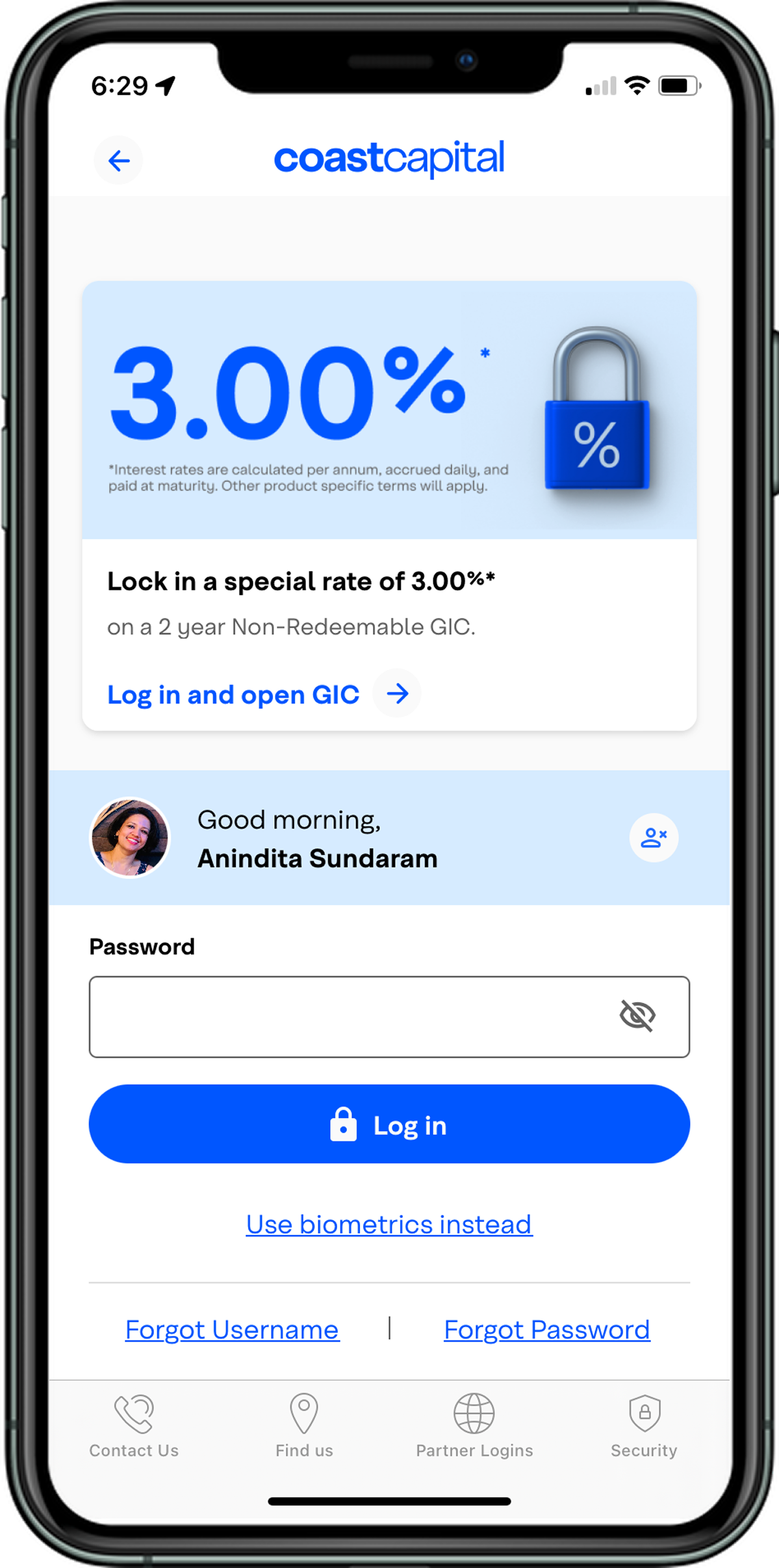


Iterated and established a defined, consistent and scalable design system extendable across technology, platform and discipline.
outcome
Successful rebrand accommodating design debt and optimization of front end code setting up for future re-brands/style based changes and challenges
Elevated app rating from 2.x to 4.x that has been maintained till date (iOS 4.5, Android 4.6)
Surviscor rating #1 mobile banking experience in Canada across credit unions maintained till date
iOS 4.5 Android 4.6
App Store Rating

#1 mobile banking experience in Canada
iOS 38 Android 32 Web 31
Digital NPS


